Watchmen – Chapter I & II (2024): The definitive animated adaptation of a comic masterpiece
Two feature-length animated films that echo panel-for-panel fidelity and hard moral questions. Sumptuous inks, ruthless framing, and a score that pulses with dread deliver Alan Moore and Dave Gibbons’ classic with rare precision. It’s not just faithful—it’s alive.
This post contains affiliate links. We may earn a commission if you make a purchase, at no extra cost to you. As an Amazon Associate, Dadnology earns from qualifying purchases.
🕰️ Introduction — Turning panels into time
If you love the comic—really love it, as in you can feel the newsprint grit and hear the rain on the glass of a certain Gila Flats memory—these films will feel like a homecoming. Chapter I and Chapter II don’t treat Watchmen as raw material for reinvention; they treat it as a language to perform. The result is a kind of cinematic literacy test the filmmakers pass with flair: the nine-panel cadence becomes rhythm, color shifts become emotional grammar, and typographic cues migrate into a soundscape of ticking clocks and sodium-lit sirens.
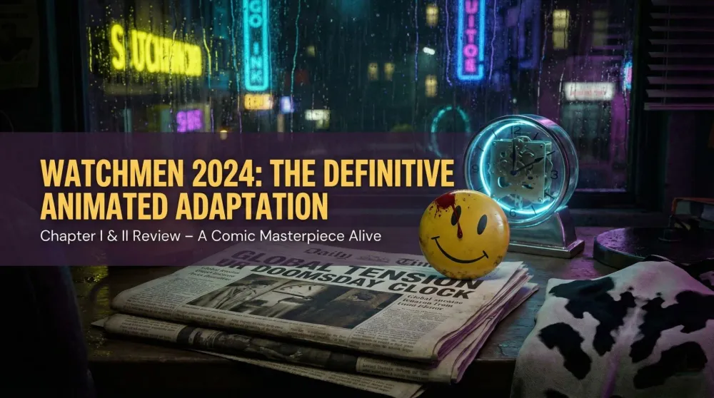
From the minute the blood beads on the smiley button, the adaptation signals what it’s here to do: translate, not dilute. And yet this is no static “motion comic.” The animation adds micro-gestures—steam haze, flicker, breath—that respect the stillness of Gibbons’ compositions while using motion to seat you inside them. We felt the shock of déjà vu and discovery in the same frame.
🎨 Visual fidelity — Ink, light, and the ethics of color
Watchmen’s legend isn’t just plot; it’s design discipline. These films preserve that discipline with invigorating precision.
- Layout Intelligence: The nine-panel grid’s heartbeat remains, even when shots are reframed. Cuts land where gutters would; reveals exploit the same left-to-right tension Gibbons orchestrated.
- Color as Argument: The palette obeys Watchmen’s logic: sickly yellows, bruise blues, funeral purples, heat-bloom neons. When Doctor Manhattan remembers Mars, the red sands hum with saturation against skin-tone neutrals, letting philosophy feel tactile.
- Line Weight & Texture: Inks are bold without being thickened to cartoon chunk. Cross-hatching holds; stipple and grime survive; reflections in a puddle carry narrative load rather than decorative noise.
- Motion Choices: The camera is modest. It glides, it does not swoop. Pans emulate eye tracking across a panel sequence; push-ins behave like the reader’s lean toward a crucial detail.
In short: the films respect the ethics of looking that the comic taught us, and the result is trust.
🧩 Structure — Two parts, one moral catastrophe
Splitting into Chapter I and Chapter II gives the story breath. Chapter I takes on the detective lattice—Rorschach’s jagged pilgrimage through hypocrisy, the Comedian’s baffling contradictions, the melancholy of failed heroes—while Chapter II shoulders the cosmological weight: Manhattan’s non-linear sorrow, Ozymandias’ terrible arithmetic, and the city caught between myth and meat.
Crucially, the break preserves pacing. Chapter I ends where the book demands an intake of breath; Chapter II begins by leaning into consequence. That choice keeps the investigation-to-revelation arc intact without compressing it to mush. We never felt hurried. We felt inescapably pulled.
🗣️ Performances & sound — Voices that don’t wink
Casting in adaptations like this often chases mimicry; these films chase temperature. Rorschach’s voice arrives as a rasp of purpose, not parody. Manhattan reads with clinical ache—intellect first, then the distance of time. Silk Spectre’s frustration lands with human oxygen, not ornament. Ozymandias finds the balance between patrician calm and messianic math.
The sound design is equally disciplined. Tick-tock motifs recur without nagging. Sirens smear across wet streets; televisions mutter; crowd noise turns to snow at moral peaks. The score (never pushy) quotes period textures—analog synth beds, brittle percussion—without falling into cosplay. You can feel the ’80s air, not just recall it.
🕵️ Rorschach — The uncomfortable spine
Rorschach is the acid test for any Watchmen adaptation. Mishandle him and you either glamorize cruelty or reduce him to a joke. The films neither canonize nor neuter him; they contextualize him. In animation, his ink-blot mask finally behaves the way your mind always animated it: shifting patterns that register changing thoughts like weather across his face. Fights are ugly, cramped, brief—no superhero pageantry, just injury.
His journal voiceovers land with bitter meter but pull back just enough to avoid romanticizing his absolutism. When the moral trap snaps shut at the end, his response is terrible, dignified, and exactly right.
🌌 Doctor Manhattan — Time as texture
Animation gives Manhattan something live-action rarely does: plausible abstraction. His glow isn’t a VFX flex; it’s an existential halo. The Mars sequences trust geometry and negative space—orbs, lines, grains of sand—to carry more meaning than any dialogue dump could. When he speaks the classic lines about the thermodynamic miracle, the visuals soften, the color temperature warms, and the music yields the floor. It isn’t sentimental; it’s merciful.
The films also preserve his non-linear perception cleanly. Cross-cutting favors echo and counterpoint, not confusion. You always know where you are in time—even as the film shows you that “where” is the wrong question.
🐙 Ozymandias — The arithmetic of ends
In Chapter II, Ozymandias’ plan plays out with surgical clarity. The adaptation never justifies him; it explains him. Boardrooms, screens, a wall of ticking deadlines—the film paints a man who has made the world data and then made himself its sole editor. The final act is staged with austere framing that refuses catharsis. The choice is presented; the cost is paid; the silence afterward is the point.
Animation helps here more than you might expect. Event-scale visuals (you know the ones) arrive with cold graphic power rather than disaster-porn indulgence. A masterstroke.
🧠 Themes — Masks, myths, and the politics of hope
The two films keep the comic’s central argument intact: heroes are stories we tell to avoid the harder stories about ourselves. Masks free and imprison; power clarifies and corrupts; nostalgia is both comfort and toxin. The subplots—Bernard and the New Frontiersman, the newsstand chorus, the pirate comic—that so often vanish in adaptations appear here with surprising fullness. They aren’t digressions; they’re the moral surround that lets the ending bruise.
We especially appreciated how the films refuse tidy answers to the end-justifies-the-means question. The camera doesn’t choose a victor; it holds the wound and asks us what it means to keep living with it.
👨👩👧 A parent’s note — Why 16+ is right
This is not a family-night superhero cartoon. Violence is purposefully ugly; sexual content and language are adult; the moral terrain is bleak by design. For teens with the maturity to parse nuance, these films can be transformative—a conversation starter about power, media, war, and the price of certainty. But go in with eyes open. The point is discomfort, not dopamine.
🧰 Craft notes — Little decisions, big impact
- Lettering Aesthetics: On-screen titles and signage echo the comic’s typography without gimmickry.
- Weather as Mood: Rain isn’t background; it’s percussion. Snow is a silence effect. Heat haze at intersections makes the city feel febrile.
- Transitions: Match cuts use shapes—circles, diagonals, color blocks—to move between scenes, mirroring how Gibbons made time slip along design rather than dialogue.
- Blood as Color, Not Splash: The films avoid glam shots; they treat violence like a stain that won’t scrub out of the frame.
🧱 Where it could wobble (but mostly doesn’t)
Purists might wish a handful of side beats lingered half a minute longer—the newsstand crosstalk can never be long enough—and one late line reading may feel a hair cooler than your inner ear prefers. But these are quibbles measured in millimeters against a canvas painted with obsession-level care. The films know what they owe the source and pay it, with interest.
🧭 For comic fans — Why this feels “right”
We keep returning to one word: proportion. So many adaptations over-explain, over-score, or over-cut. These films remember that restraint is the grammar of Watchmen. When a frame wants you to lean in, the camera stops. When a line wants you to chew it, the score hushes. When a choice wants to scandalize or seduce you, the film trusts that it already has. That trust—of text and of audience—feels like respect.
And yes, the “mirror” quality survives. The films don’t flatter us with superiority over the world they indict; they ask whether we, too, would trade truth for peace, comfort for certainty, now for later. That question is why Watchmen remains necessary. These films give it a new body.
Pros
- A remarkably faithful, respectful adaptation of the comic
- Animation that honors Dave Gibbons' iconic panel compositions
- Preserves the source's structure, themes, and moral weight
- Strong voice performances carry the philosophy
- For comic fans, about as close to ideal as it gets
Cons
- The animation style and budget will divide some viewers
- Dense and demanding — tough as a newcomer entry point
- The two-chapter split fragments the experience
- Grim, mature, adults-only tone throughout
🗣️ Conclusion — The smile and the blood
Two features, one verdict: definitive. Watchmen – Chapter I & II demonstrates how animation can dignify a classic rather than cosplay it—how movement can honor composition, how performance can carry philosophy, how craft can preserve moral weather. We loved the comic long before this release; we love it more now, having seen it breathe without compromise. For comic fans, this is as close to ideal as we could reasonably ask.
📺 Movie night sorted: thousands of films and shows are streaming on Prime Video — free for 30 days. Worth a look before you buy the disc.
Related Dadnology review: our Sin City: A Dame to Kill For review covers the other end of the mature graphic-novel-adaptation spectrum.
📌 FAQ – Frequently asked questions
Do I need to read the comic first?
What ages are appropriate?
How does the animation compare to live-action versions?
Is the ending changed?
Keep this in your inbox
One email a week: what we actually watched, built and reviewed — the stuff worth a dad's time. No hype, no daily spam.
Dadnology Weekly
One email a week: the LEGO, gaming and movie news worth a dad's time — plus what we actually reviewed. No hype, no daily spam.
Disclaimer: This review and its visuals were created with the help of AI. Some links may be affiliate links – we may earn a commission if you make a purchase, at no extra cost to you.
Current deals in Movies & TV
Verified live discounts tracked on Amazon
![The Legend of Korra — The Complete Series [Blu-ray]](https://m.media-amazon.com/images/I/51+1TXyb7aL._SL500_.jpg)
Movies & TV · Tested by Dadnology
The Legend of Korra — The Complete Series [Blu-ray]
4.5/5“A new Avatar, a modern city, a masked revolution”Read our review
Movies & TV · Tested by Dadnology
Zack Snyder's Justice League (4K Ultra HD)
4/5“Four hours. One vision. This is the film.”Read our review
Movies & TV · Tested by Dadnology
Space Jam (4K Ultra HD + Digital)
4/5“It's gonna be a whole new ball game”Read our reviewYou might also like
Crime 101 review: A tense heist thriller with a stacked cast
A tense, well-staged heist thriller with a top-class cast that kept us entertained. It does not rise above the genre. Rating: 3.5/5.
Mickey 17 review: Inventive sci-fi, but not a must-see
A good, inventive sci-fi film that kept us entertained, with a fully committed Robert Pattinson. But it is not above average and not a must-see. Rating: 3.5/5.
Tenzing review: The Everest story finally told from his side
A fascinating true story that deserved a film. It takes a little time to start, but the tension, the way Tenzing's past is woven in and the mountain photography are excellent, and the summit scene is genuinely moving. Rating: 4.5/5.